Models of "model" a linguistic network graph
Modelling is a concept that is central to DH, though its various linguistic associations can encompass complementary and contradictory meanings. By happy providence, the act of modelling itself leads to new insights for our KDL Postdoctoral Research Associate Chris Pak ...
I took up the gauntlet of developing a visualisation that would complement a forthcoming paper by Cristina Marras and Michela Tardella entitled “Modelling between Digital and Humanities: Looking Back and Forward,” part of the Volkswagen Foundation-funded project “Modelling Between Digital and Humanities: Thinking in Practice”. This paper will appear as a chapter in an open-access collection edited by researchers on the project.
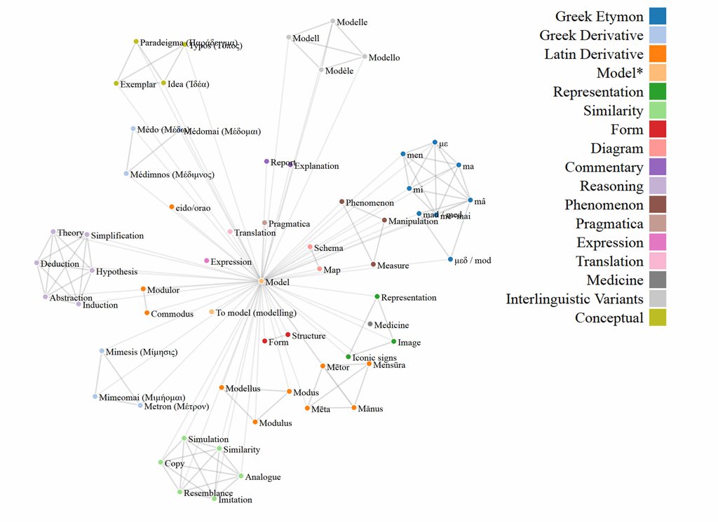
Marras and Tardella investigate the varied meanings of “model” by exploring its etymology and by distinguishing words closely associated with “model” and which, taken together, make up a network of associated terms. By outlining its etymology and by identifying words that have been associated with “model” the authors outline the broad meaning of this term and provide a base for further investigation into their academic use in the humanities.
Because the relationships between all these terms are complex and because there are a large number of them associated with “model,” a visual representation offers a quick and easy way to make intuitive sense of these connections. Developing this visualisation lets us pilot these techniques in preparation for further visualisations that could be used to represent the findings from an analysis of academic journal articles to investigate modelling in the humanities.
I needed to identify an approach that would produce a visualisation suitable for print and web presentation and that made the best use of the limited time available. After reviewing several options, I decided that a network graph would be the most suitable way to represent the relationships between terms. After all, it’s a ubiquitous and readily understandable format in DH.
D3.js is the swiss-army knife of dataviz toolkits - it’s scalable, allows flexible styling, is easily deployed (and thus consumed) and it’s free! Sure there’s a learning curve to climb, but that’s nothing a little coffee and determination can’t overcome, and with minimal frustration I was able to develop a graph format that can now be re-used throughout the lifecycle of the project.
(Graph will be reproduced in full detail in “Modelling between Digital and Humanities: Looking Back and Forward”)
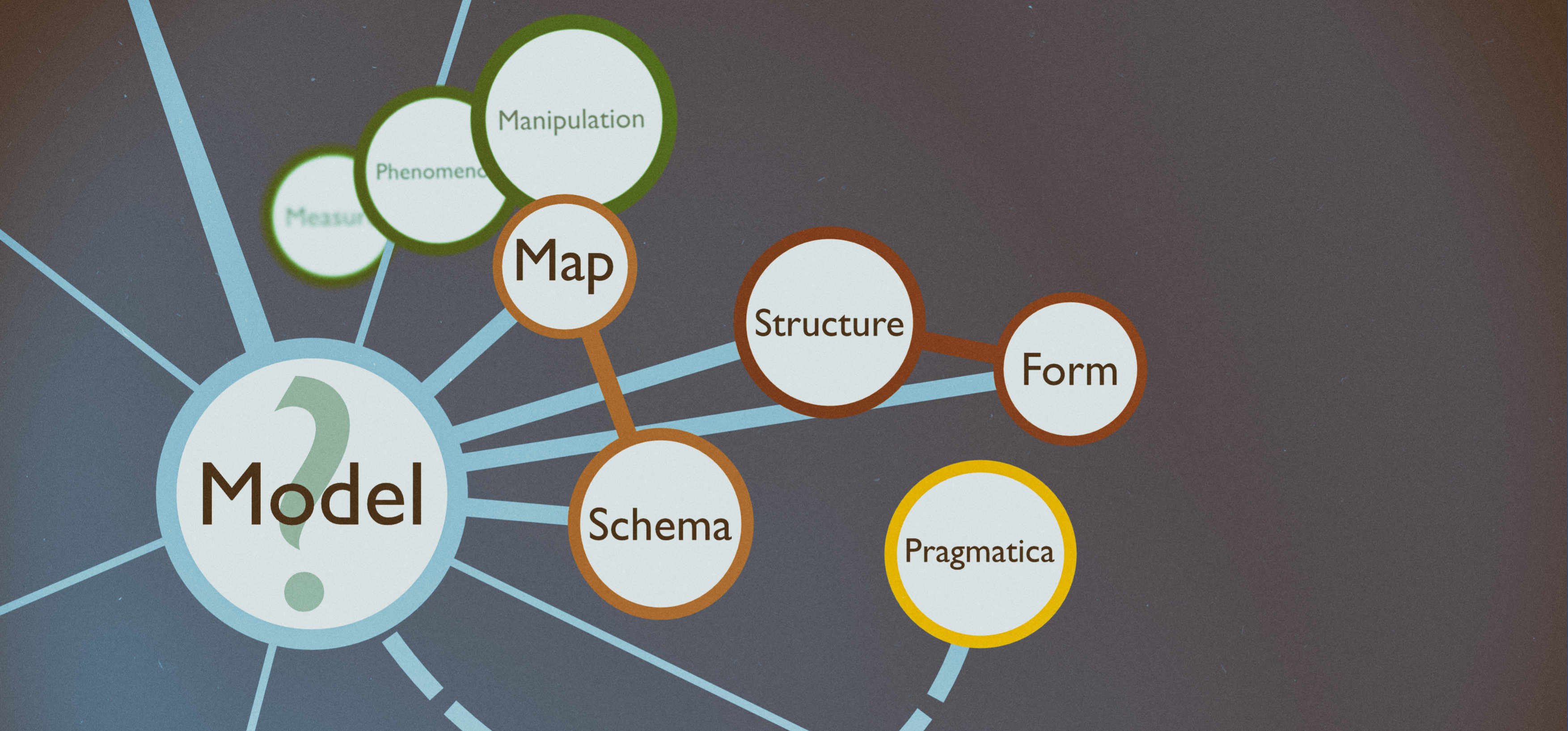
The distances between terms were governed by aesthetic and pragmatic reasons and not by quantitative measures. While the network graph that I eventually constructed allows us to see which terms are related to which, the connections between them are only meaningful in that they indicate a connection raised in the article. The network graph shows us which terms are related to “model” and it shows us which of these terms are related to others, but it does not tell us anything more about the type or strength of the connection itself.
Each group of related terms is colour coded and labels are contained in a legend. Devising the groups proved to be tricky as terms tended to overlap with one another. In some cases I adhered to the groups that were defined by the paper itself and in others I created connections between terms that were clearly related. For example, the Latin root Modus refers to ‘a measure,’ which is also one of the twenty-eight words semantically related to ‘model’. As the paper discussed Latin terms as one group and terms relating to measurement in another section of the paper, I chose not to collapse these into a single group. The benefit of this approach is that the network graph preserves the groups and the relationships discussed in the paper but still allows us to make these relationships explicit. In other cases, however, I created a single group for terms that are related in English. An example of this decision includes the terms “Resemblance”, “Copy”, “Imitation”, “Simulation”, “Similarity” and “Analogue,” which all relate to the concept of similarity. The choice of name for each group was derived from the terms within that group itself and is, of course, highly subjective; arguments for other choices of label could very well be made.
We now come to the most time-consuming aspect of the visualisation, which I record here for posterity. Perhaps my travails will be of some use to those who follow in my footsteps. ‘You will rejoice to hear that no disaster has accompanied the commencement of an enterprise which you have regarded with such evil forebodings’ (Frankenstein). Indeed, the code for the visualisation resembled nothing so much as a monstrous stitching together of human and animal body parts in Frankenstein to create something new. Implementing the graph involved a long process of trial and error, yet the flexibility offered for future adaptations made the effort worth the trial.
There were a range of network graphs available as models through the d3.js library. I opted to adapt Mike Bostock’s force-directed network graph. I needed to adjust various elements of the code and the json data for my own purposes, particularly with future applications in mind. To this end I inserted a legend, introduced new fields in the json file to insert quantitative data to determine the length and thickness of the connections between nodes and inserted labels for each of the nodes. As we were using Greek and Latin characters I also needed to ensure that they would be displayed correctly, and thus included a line of code to define the type of encoding the browser was required to read. The html file could then be dragged and dropped into a Firefox browser to view and interact with the dynamic visualisation.
I then created an Excel template to manage the data in the json file. This enabled me to quickly generate code that could be copy and pasted into a json file, which could then be used to generate the network graph.
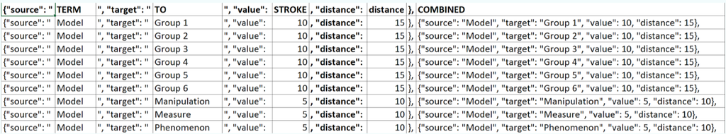
Using Excel to edit a JSON file is a great way for reluctant coders to control a visualisation's parameters
The distances between all the nodes of the graph can thus be adjusted simply by entering new values in the relevant Excel column and copy and pasting this data into the relevant section of the json file. Likewise the width of all of the connections between nodes can be modified, as can the groupings of terms for the colours of the nodes and the accompanying legend. This enables us to re-purpose the network graph to generate visualisations of quantitative data based on linguistic and statistical analyses of academic journal articles. The dynamic graph can be manually re-arranged so that static images can be generated through screen capture.
As a first attempt at creating a visualisation that could be re-used, this exercise was successful on several fronts. First and foremost I had to learn how to navigate the d3.js library and the host of resources and tutorials available, which was possibly the most time-consuming and difficult element of this exercise. It required me to think about the relationship between elements of a visualisation and to consider how best to represent a written account visually. Along the way I researched a range of other types of visualisation and learnt how to adapt examples for my own purposes. Perhaps most importantly, it allowed me to think more deeply about modelling and to tease apart the relationships between etymologically linked and semantically associated terms. This activity reflects one aspect of the practicalities involved in modelling, namely that the act of creating a model involves the modeller in an iterative, experimental process that enables them to learn from the process of implementation itself.
I also investigated other types of visualisation. In particular I was attracted to the notion of a timeline that could be embedded in a webpage but the reason I opted for a network diagram was because it lends itself to publication as a static image while one of the chief attractions of the timeline is its interactivity. However, because the paper tells a story of the development of the term “model,” a timeline would offer the benefit of organising this story in a visually attractive and intuitive manner. It would also allow me to extend the visualisation by including examples of the terms as they were used at various points in history in a manner similar to the Oxford English Dictionary’s online database of examples. This resource would offer a useful touchstone for scholars wishing to explore modelling from interdisciplinary perspectives and could form a valuable addition to the project, perhaps as part of a postulated phase II extension.
Dendrograms offer another possible type of visualisation that could be used to visualise “model” and its roots and associated terms. I opted not to use this type of graph because of its hierarchised structure, which did not suit the kinds of relationships that I was illustrating. However, these could be used to visualise findings from an analysis of the journal articles that I shall be conducting and is particularly suited to representing the terms that appear alongside “model.” This visualisation offers another way to explore the large amounts of data that a linguistic analysis of modelling in journal articles would uncover.
The final product was not exactly what I had aimed for when I set out to create the visualisation. Nevertheless, it was very close, and I was able to devise alternative solutions to work around the problems involved in implementing some of its more ambitious features. In a short amount of time I was able to engage with modelling in the humanities to create tools that I will likely use throughout my career. Working with project partners based at the University of Cologne, we shall continue development of the graph to further refine it.